ggplot2-wrapper to summarise and plot data (of rOstluft::format_rolf() format) as boxplots comparing weekdays to weekends
Source: R/ggperiodic.R
ggweekend.Rdggplot2-wrapper to summarise and plot data (of rOstluft::format_rolf() format) as boxplots
comparing weekdays to weekends
Usage
ggweekend(
  data,
  y = "value",
  nmin = 3,
  fun = list(middle = "mean", middle2 = "median", ymin = "percentile05", lower =
    "percentile25", upper = "percentile75", ymax = "percentile95"),
  ...
)
Arguments
- data
a data.frame or tibble containing the data
- y
a character string specifying the taget variable to be summarised, usually "value". outcomes of
cut_timeseries_periodic().- nmin
numeric, minimum number of values for fun, if n < nmin: NA is returned
- fun
function or list of functions for summary, can be named (then the outut stat is named after the function's name); Strings matching the regular expression
/^percentile([0-9]){1,2}$/iare converted into the respective function. "percentile95" =>function(x, ...) quantile(x, 95 / 100, ...)- ...
further arguments passed on to
ggplot2::geom_boxplot().
Value
ggplot2::ggplot() object
Examples
library(ggplot2)
fn <- rOstluft.data::f("Zch_Stampfenbachstrasse_2010-2014.csv")
data <-
rOstluft::read_airmo_csv(fn) %>%
dplyr::filter(parameter %in% c("NOx", "O3", "PM10")) %>%
rOstluft::resample(new_interval = "h1")
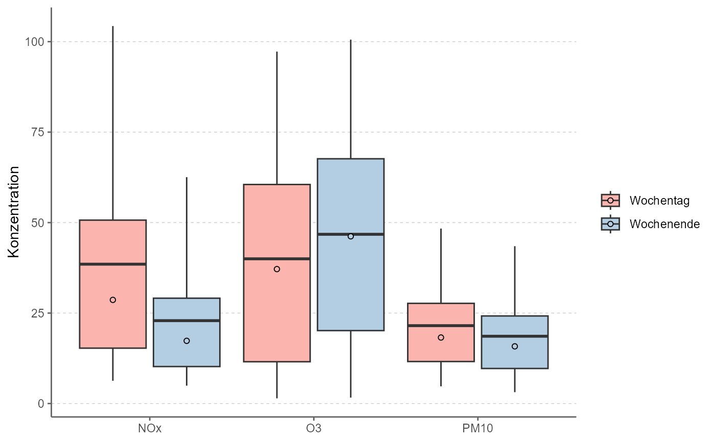
ggweekend(data)
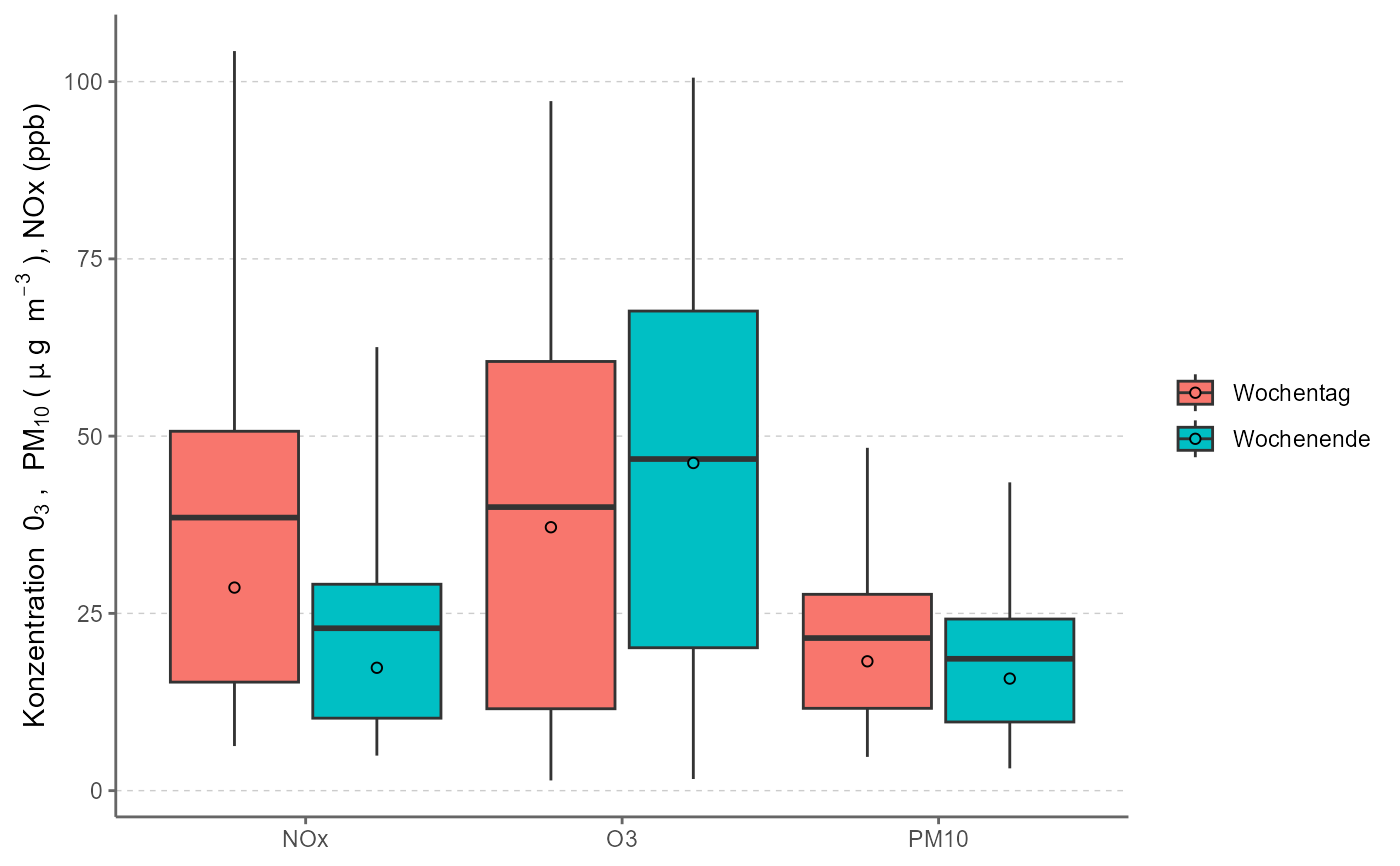
 # change y axis title using bquote
ggweekend(data) +
ylab(bquote("Konzentration " ~ 0[3] ~ ", " ~ PM[10] ~ "(" ~ mu ~ "g " ~ m^{-3} ~ "), NOx (ppb)" ))
# change y axis title using bquote
ggweekend(data) +
ylab(bquote("Konzentration " ~ 0[3] ~ ", " ~ PM[10] ~ "(" ~ mu ~ "g " ~ m^{-3} ~ "), NOx (ppb)" ))
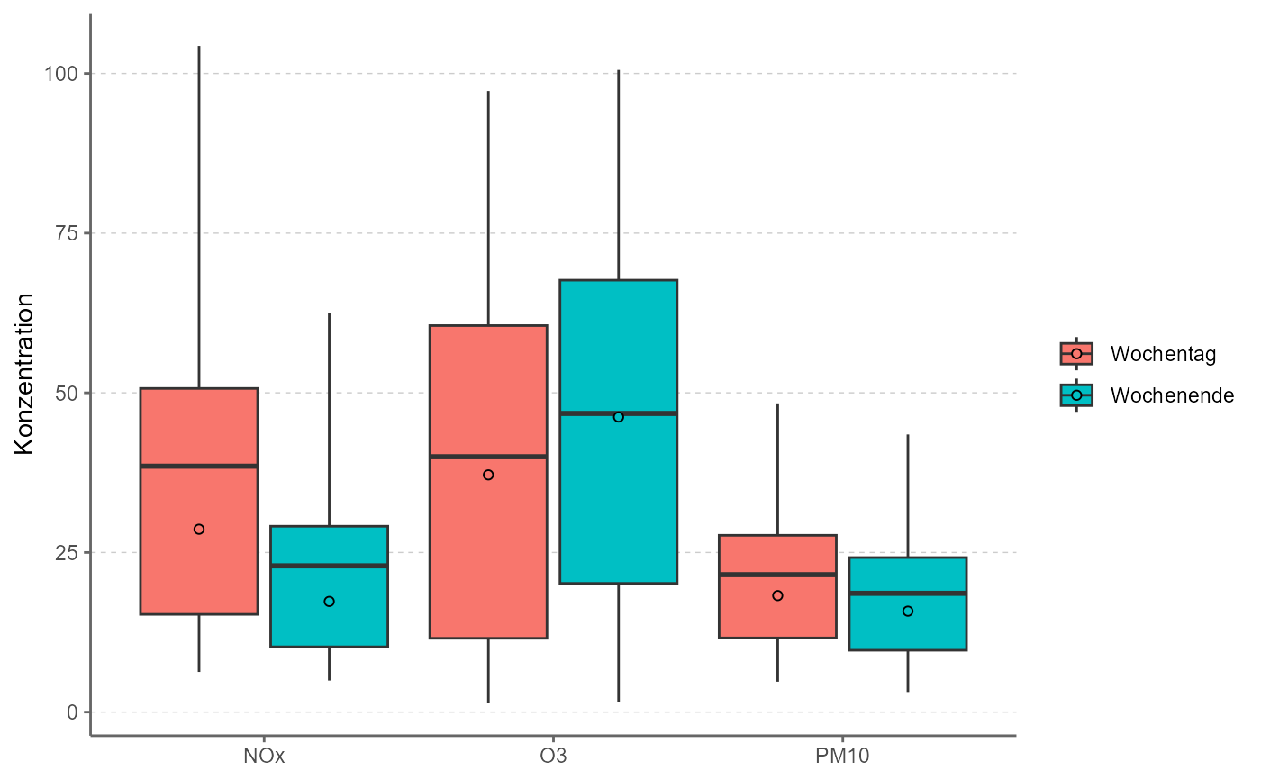
 # change fill scale
ggweekend(data) +
scale_fill_brewer(type = "qual", palette = "Pastel1")
#> Scale for fill is already present.
#> Adding another scale for fill, which will replace the existing scale.
# change fill scale
ggweekend(data) +
scale_fill_brewer(type = "qual", palette = "Pastel1")
#> Scale for fill is already present.
#> Adding another scale for fill, which will replace the existing scale.